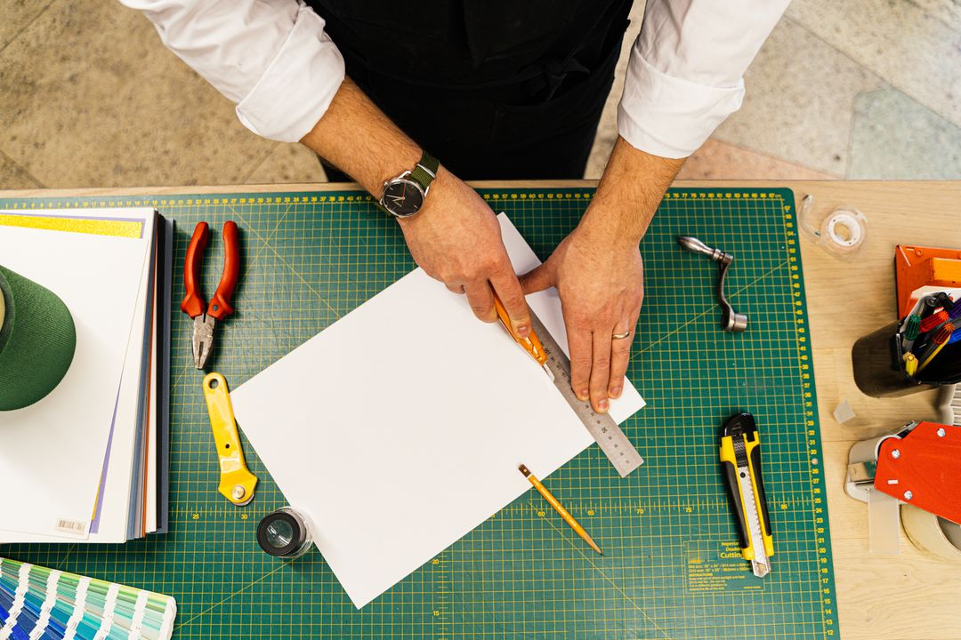
In the pristine digital realm of your agency’s studio, design is a matter of absolute precision. Pixels align perfectly, colours glow with luminescent intensity, and every vector sits exactly where it was summoned. But when that design crosses the threshold from the digital screen to the physical press, it enters the messy, physical world of paper, steel blades, and rapid motion.
This is where the magic happens, but it is also where minor artwork oversights can lead to major client disappointment.
At Print Lord, we believe that buying print should be easy, drama-free, and consistently brilliant. We are not a faceless click-and-pray automated portal where files are pushed through a conveyor belt regardless of errors. We take responsibility. That is why we are pulling back the curtain on one of the most common stumbling blocks in print production, artwork bleed.
If you have ever received a box of brochures only to find an unprofessional, hair-thin white sliver running along the trimmed edge, you have experienced the consequence of missing bleed. Here is everything your agency studio needs to know to ensure your designs are cut perfectly, every single time.
Why Paper Needs Room to Breathe: What is Bleed?
To understand bleed, we must first understand how paper is finished. When your brochures, flyers, or business cards are printed, they are not printed individually on tiny sheets of paper. They are printed alongside other jobs on massive sheets of high-grade stock. Once the ink is dried and cured, these giant sheets are fed into a heavy, razor-sharp guillotine to be sliced down to their final size.
Although modern print finishing machinery is incredibly advanced, paper is an organic, tactile material. As the guillotine blade descends through a stack of hundreds of sheets, microscopic shifts can occur. The paper might move by a fraction of a millimetre, or the blade might deflect ever so slightly.
If your design stops precisely at the trim line, even a microscopic shift of 0.5 millimetres will leave an unsightly, unprinted white paper edge showing on one side of your finished product.
To solve this physical limitation, we use artwork bleed. Bleed is simply the extension of your background design, images, or colours beyond the final trim line. By extending your creative assets slightly further than the finished size, you create a safety margin. When the guillotine cuts through the sheet, it cuts directly through your extended design, leaving a flawless, edge-to-edge finish.
The Royal Standard: The 3mm Bleed Rule
In the UK print industry, the standard requirement is 3mm of bleed on all sides of your document.
This means that if you are designing an A4 flyer, which has a finished trim size of 210mm by 297mm, your actual artwork file size must be 216mm by 303mm. Those extra 6 millimetres on the width and height are the bleed areas that will be cut away during the finishing process.
Setting this up in professional design software like Adobe InDesign or Illustrator is straightforward. When creating a new document, simply enter “3mm” into the Bleed fields. Your workspace will display a red outer border representing the bleed line. Your background images, solid colours, and decorative patterns must stretch all the way to this red line.
If you are using tools like Canva, things can be slightly trickier, but the principle remains the same. You must manually account for that extra outer boundary or use Canva’s built-in bleed settings before exporting your high-resolution PDF. If your team ever finds themselves in a Canva bind, Print Lord is always at your service to run a quick artwork rescue mission.
For a comprehensive, step-by-step breakdown of file preparation across different design programs, you can check out our Cornerstone Guide, ‘The Complete Artwork Preparation Guide’.
The Quiet Zone: Respecting the Safe Margins
While bleed extends outward from the trim line, there is an equally important boundary that moves inward, the safe zone, or quiet zone.
Just as the paper shift can cause a white sliver if you do not use bleed, that same movement can push critical elements too close to the cutting edge if they are placed too far out.
The safe zone is typically a 3mm or 5mm margin inside the finished trim line. Within this space, no essential text, logos, page numbers, or vital graphic elements should exist. If you place a client’s telephone number or a crucial legal disclaimer right up against the trim line, you run the very real risk of that text being sliced in half by the guillotine blade.
When you combine a 3mm outer bleed with a 3mm inner safe zone, you create a robust, worry-free buffer that guarantees absolute precision, protecting your agency’s hard-earned reputation and keeping your clients exceptionally happy.
—
Agency Print Clinic: How Do We Avoid Colour Shifts?
Welcome to our weekly Agency Print Clinic, where we answer real questions from production desks and creative studios across the UK.
This week’s question comes from a studio manager in Brighton:
“We recently designed a luxury brochure with a deep, vibrant blue background. On screen, it looked magnificent, but when the printed copies arrived from our previous supplier, the blue felt muddy and slightly purple. Why did this happen, and how do we prevent these colour shifts in the future?”
Print Lord’s Decree:
This is a classic tale of two completely different worlds, the world of light and the world of ink.
Your computer screens, tablets, and smartphones display images using the RGB colour spectrum, Red, Green, and Blue light. Because screens emit light directly into your eyes, they can produce incredibly bright, neon, and highly saturated colours.
In contrast, printing presses use the CMYK colour spectrum, Cyan, Magenta, Yellow, and Key (Black) inks. This is a subtractive colour process where light reflects off the physical paper. Because paper cannot emit light, the physical range of colours, or gamut, that ink can produce is significantly smaller than what a glowing monitor can display.
When you send an RGB file straight to a standard printer, their automated system has to make a guess. It converts your vibrant RGB screen colours into CMYK ink formulas, often resulting in disappointing, muddy colour shifts. Blues turn to purple, bright greens become olive, and bright oranges turn a flat, earthy brown.
To avoid these surprises and protect your brand consistency, follow these three rules of colour guardianship:
- 1. **Convert to CMYK Early:** Always set your design software document profile to CMYK before you start designing. This ensures that the colours you choose on screen are a closer approximation of what can actually be achieved on paper.
- **Use Pantone Matches for Brand Assets:** If your client has a strict brand colour that cannot be compromised, such as a specific corporate blue or a vibrant orange, use the Pantone Matching System (PMS). Pantone colours are pre-mixed inks that deliver absolute colour consistency across different print runs.
- **Request a Physical Proof:** Never rely solely on a digital PDF proof for critical colour matching. If color accuracy is mission-critical, ask Print Lord for a physical printed proof. It is the only way to see exactly how the ink behaves on your chosen paper stock before the full production run begins.
—
Making Print Buying Drama-Free
At Print Lord, we understand that marketing agency schedules are fast-paced, budgets are under pressure, and client expectations are incredibly high. The last thing you need is a print partner who prints bad artwork blindly, only to blame your studio when the final product is ruined.
We don’t do that. We take pride in being your proactive brand guardians. When you upload artwork to our online shop, we don’t just throw it on the press. We check the bleed, we check the safe zones, and we verify the colour profiles. If something looks amiss, we pick up the phone and help you fix it before a single sheet of paper is printed.
Whether you are printing custom brochures, exhibition banners, or high-end bespoke collateral, we are here to make the process simple, reliable, and completely stress-free.
If you are reviewing your current print setup or preparing for an upcoming client campaign, consolidating your print purchasing into one trusted, online platform can save your account managers hours of admin. Let us take care of the details so your creative studio can focus on what they do best, delivering legendary campaigns.
For more helpful checklists and expert guides, visit us at printlord.co.uk.