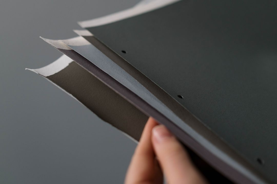
You have spent hours polishing your copy, refining your layout, and tweaking your brand colours until they look perfect on your screen. The artwork is exported, the PDF is ready, and then you hit the moment of truth in the print process: choosing your paper finish.
Do you want silk, gloss, matt, or uncoated?
To the uninitiated, this choice can feel like ordering coffee in a foreign language. Select the wrong paper coating and your sharp photography can look dull, or your beautiful long-form brochure might become unreadable under bright office lights due to harsh reflection.
At Print Lord, we believe that choosing print materials should never feel like a guessing game. Paper stock and coating are not decorative afterthoughts. They are fundamental touchpoints that dictate how your customer physically feels your message, how light interacts with your ink, and how your brand is perceived.
Here is our plain English, no-nonsense guide to paper surface coatings, what each finish actually does, and how to choose the right one for your business without falling into costly traps.
The Core Split: Coated vs Uncoated Paper
Before diving into silk, gloss, and matt, it helps to understand the two master categories of paper stock: coated and uncoated.
Uncoated paper is paper in its rawest, most natural state. Think of standard printer paper, classic letterheads, or high-end novel pages. Ink soaks directly into the fibres of uncoated paper like water into a sponge. This creates a soft, tactile, organic feel, but it also means ink spreads slightly, resulting in softer color reproduction.
Coated paper, on the other hand, has a micro-thin layer of clay or mineral coating applied to its surface during manufacturing. This coating fills in the tiny microscopic gaps between paper fibres, creating a smooth, flat barrier. When ink is applied to coated paper, it sits on top of the surface rather than sinking in. The result is sharper lines, denser blacks, and vibrant color output.
Silk, gloss, and matt are all variations of coated paper. They share the same ink retention benefits, but they handle light, reflection, and touch in fundamentally different ways.
1. Silk Finish: The Versatile All-Rounder
If commercial print had a dependable hero, it would be silk. Silk paper finish sits perfectly in the middle ground between high gloss and flat matt. It possesses a subtle satin sheen that reflects light gently without creating blinding glare.
Key Characteristics of Silk Finish:
- Surface: Smooth with a satin sheen.
- Text Readability: Excellent readable text. Because it lacks extreme glare, eye strain is kept to a minimum when reading longer blocks of copy.
- Color Output: Crisp, rich, and sharp. Images look vibrant while text remains crisp and defined.
Best Used For:
- Corporate brochures and company handbooks
- Product catalogues and promotional flyers
- Multi-page presentation folders
- High-end event programmes
Why Choose Silk?
Silk is the safe, highly professional choice when your document balances detailed artwork or photography with significant amounts of written content. It gives your sales collateral a polished, premium feel while keeping every single word comfortable to read under office lighting.
2. Gloss Finish: Maximum Impact and Vibrant Imagery
Gloss paper finish is built for drama, contrast, and visual energy. It features a shiny, highly reflective coating that locks ink on the surface, producing deep, rich blacks and glowing, high-contrast imagery.
Key Characteristics of Gloss Finish:
- Surface: Highly polished, slick, and light-reflective.
- Text Readability: Moderate. High specular reflection means long paragraphs can reflect overhead bulbs, making dense text tiring to read.
- Color Output: Vibrant photographs. Colors look intense, photographs pop, and detailed images take centre stage.
Best Used For:
- Photographic portfolios and fashion lookbooks
- Restaurant menus with prominent dish photography
- High-impact marketing flyers and promotional posters
- Product packaging sleeves
Why Choose Gloss?
Choose gloss when photography is the main hero of your piece. If you are showcasing brilliant landscapes, vivid dishes, or high-definition product imagery where color intensity matters most, gloss coating amplifies visual punch like nothing else.
3. Matt Finish: Modern Elegance and Non-Reflective Distinction
Matt coated paper provides the ink-locking precision of a coated stock, but with zero surface shine. It absorbs light completely, resulting in a smooth non-reflective finish that exudes understated sophistication.
Key Characteristics of Matt Finish:
- Surface: Exceptionally smooth non-reflective finish.
- Text Readability: Superior. Zero reflection ensures effortless reading from any angle and under any light source.
- Color Output: Softened elegance. Colors remain deep and accurate, but without the artificial shine of gloss.
Best Used For:
- Premium brand brochures and luxury catalogues
- Architecture and interior design portfolios
- High-end art books and annual reports
- Minimalist promotional materials
Why Choose Matt?
Matt paper is favored by brands that want to convey authority, luxury, and quiet confidence. It avoids flashy reflections, letting clean typography and elegant photography speak for themselves with subtle, tactile quality.
4. Uncoated Paper: Warm, Organic, and Tactile
While coated papers dominate marketing collateral, uncoated stock remains the king of personal connection and functional print.
Key Characteristics of Uncoated Paper:
- Surface: Absorbent, warm, writable, and completely matte.
- Writable: 100% writable with any pen, pencil, or rubber stamp.
- Color Output: Warm, earthy, and muted. Ink sinks into the sheet, giving artwork a rich, vintage, or organic aesthetic.
Best Used For:
- Official letterheads, invoices, and stationery
- Appointment cards and loyalty cards (where stamps or pen ink must not smudge)
- Notelets, greeting cards, and wedding stationery
- Eco-conscious brand literature and takeaway menus
Why Choose Uncoated?
If your print piece requires a human touch, writing, or stamping, uncoated is non-negotiable. Ballpoint pens and rubber stamps will smear endlessly on gloss or silk paper, but they dry instantly on absorbent, warm, writable uncoated stock. Uncoated paper also communicates authenticity and environmental responsibility.
Quick Decision Guide: Which Paper Finish Fits Your Project?
| Project Type | Recommended Finish | Why It Works |
|---|---|---|
| Sales Brochure with Text & Images | Silk | Satin sheen that combines readable text with crisp image definition. |
| Photo Booklet or Menu with Dishes | Gloss | Highlights vibrant photographs, maximising color depth and contrast. |
| Luxury Brand Profile / Art Portfolio | Matt | Smooth non-reflective elegance that looks sophisticated and clean. |
| Loyalty Card / Appointment Card | Uncoated | Absorbent, warm, writable surface allows pens and stamps to dry instantly. |
| Corporate Letterhead / Invoice | Uncoated | Runs smoothly through office desktop printers without melting or smudging. |
Frequently Asked Questions About Paper Finishes
Can I write on silk or gloss paper?
Generally, no. Ballpoint pens and permanent markers will smudge on gloss paper, and liquid ink will not dry properly on silk coatings. For forms, feedback sheets, or cards requiring handwriting, always opt for uncoated stock.
Is matt paper the same as uncoated paper?
No, this is one of the most common print misunderstandings! Matt paper is a coated stock with a smooth non-reflective surface that holds ink sharp on top of the sheet. Uncoated paper has no mineral coating whatsoever and absorbs ink directly into its fibres.
How does paper weight (GSM) relate to paper finish?
Paper weight (measured in grams per square metre) dictates thickness and rigidity, while finish dictates surface texture and light reflection. You can have a light 130gsm silk flyer or a heavy 350gsm silk business card board. Both share the same silk surface finish, but differ in thickness.
At Your Service: Finding Your Perfect Print Match
Paper selection is not something you should have to figure out by guesswork or crossing your fingers over a generic online portal basket. The feel of your print in a customer’s hand speaks before they read a single headline.
At Print Lord, we manage every project with care, clarity, and deep expertise. Whether you need a high-contrast gloss flyer, a satin silk corporate brochure, or an organic uncoated loyalty card, we guide you to the exact stock and finish that protects your brand image and delivers results.
Got a project in mind or need physical samples to feel the difference for yourself? Speak to Print Lord today.
Print Lord. At your service. On brand. On time.
printlord.co.uk