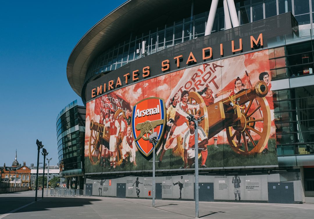
When a brand decides to scale up its visual presence, standard print rules expand into a whole new dimension. Large format printing is not simply taking a business card file and clicking stretch. Whether you are preparing roller banners for an industry exhibition, outdoor banners for a seasonal event, hoardings for a development site, or wrapping an entire building, large format signage demands careful planning, technical precision, and an uncompromising eye for detail.
In physical marketing, high-impact outdoor graphics command presence like nothing else. They stop passers-by in their tracks, transform bare hoardings into compelling brand stories, and turn high-street storefronts into local landmarks. However, when graphics are produced at a massive scale, every design choice, material specification, and resolution setting is magnified. A minor artwork flaw that hides on an A4 leaflet can turn into an eye-watering distraction on a ten-metre building banner.
Print Lord stands as a trusted ally for businesses ready to command attention across Brighton, Hove, London, and nationwide. Below is the definitive guide to planning large format signage that looks majestic, resists the elements, and delivers results on brand and on time.
Viewing Distance: Why Your DPI Math Changes at Scale
One of the most common pitfalls in large format print prep comes from artwork resolution and viewing distance. In standard commercial print, such as brochures or flyers, artwork is typically set to 300 DPI (dots per inch) because readers hold the paper roughly thirty centimetres from their eyes. At that close range, the human eye easily notices pixelation or softness.
When planning large format signage, the rule of viewing distance changes everything. People rarely view a six-metre outdoor banner or a building wrap from thirty centimetres away. They see it from ten, twenty, or even fifty metres across a busy street or highway.
- Close range (0 to 2 metres): Exhibition stands, pop-up displays, and indoor wall graphics require 150 to 300 DPI to maintain sharp detail up close.
- Medium range (2 to 10 metres): Outdoor promotional banners, street-level signage, and retail window graphics look crisp and clear at 100 to 150 DPI.
- Far range (10+ metres): Building wraps, elevated billboards, and stadium banners often use 50 to 100 DPI at full scale, or artwork built at 1:10 scale at 300 DPI.
Understanding this principle prevents massive artwork file sizes that crash design software while ensuring that graphics look razor-sharp from the precise distance your audience experiences them.
Choosing the Right Weather-Resistant Materials
Outdoor graphics must fight a daily battle against wind, rain, direct sunlight, and physical wear. Selecting the right substrate is essential to ensure your investment stays vibrant and secure over its intended lifespan.
Heavy-Duty PVC Banners vs Mesh Banners
For short to medium-term outdoor campaigns, standard PVC banners offer vibrant colour reproduction and excellent durability. However, if your display is located in an exposed high-wind area, such as a scaffold, bridge, or high-rise building, solid PVC acts like a giant sail.
Mesh banners are engineered specifically for windy environments. Microscopic perforations allow wind to pass directly through the material without tearing eyelets or putting excess strain on support structures. Because light passes through the mesh, colours are optimized for high contrast so your visual message remains bold and legible from a distance.
Aluminium Composite (Dibond) and Rigid Signage
For permanent storefronts, industrial park signs, or long-term site hoardings, rigid substrates offer unmatched stability and smooth finishes. Aluminium composite paneling features a solid polyethylene core sandwiched between two thin sheets of aluminium. It does not warp in direct heat, handles freezing winter conditions, and provides a pristine canvas for high-resolution direct-to-panel printing or laminated vinyl graphics.
UV-Stable Inks and Protective Laminates
Sunlight is the relentless enemy of outdoor print. Unprotected inks fade rapidly under direct ultraviolet radiation. Print Lord utilizes UV-stable inks cured with intense ultraviolet light during the printing process. This bonds the ink directly to the substrate, creating water-resistant, fade-resistant finishes that retain their rich colours through unpredictable British seasons. Adding anti-graffiti or matte protective laminates further guards against scuffs, environmental grime, and direct sun glare.
Structural Fixing and Site Considerations
An impressive banner design is useless if it cannot be safely and securely mounted. Site conditions dictate fixings, tensioning systems, and structural safety requirements.
Before finalizing artwork dimensions, confirm where and how the signage will be installed:
- Eyelets and Cable Ties: Ideal for temporary outdoor fence banners and scaffolding attachments.
- Pole Pockets: Essential for hanging banners where weighted or rigid poles keep the print smooth and flat.
- Keder Tracks and Frame Systems: Preferred for large building wraps and replaceable wall graphics, providing smooth tension without sagging or creasing.
- Direct Wall Mounting: Requires flat surfaces and appropriate masonry fixings to keep rigid panels flush and secure.
Conducting a thorough site check early avoids last-minute panics, structural mismatches, or unexpected wind load issues on installation day.
Designing for Maximum Impact: Less Is More at Scale
Large format signage is not a brochure. Drivers and pedestrians typically have between two and five seconds to absorb your visual message. High-impact outdoor graphics rely on clarity, typography, and contrast.
- Dominant Focal Point: Lead with one clear headline, striking imagery, or a bold logo.
- High Contrast: Pair light text with dark backgrounds or vice versa. Avoid subtle tonal shifts that wash out under bright sunlight or grey winter skies.
- Clear Call to Action: Use short website URLs, memorable phone numbers, or prominent brand names rather than long blocks of explanatory text.
- Clean Typography: Bold, clean sans-serif and strong serif fonts readable at speed outperform delicate, decorative scripts every time.
Partnering with Print Lord: Large Format Done Right
From initial artwork checks to material selection and nationwide delivery, Print Lord takes responsibility for your large format projects. You never have to guess whether your artwork scale is correct or whether your banner material will withstand coastal winds in Brighton or urban displays in London.
Print Lord delivers complete peace of mind. Every job is thoroughly inspected, artwork is guarded against costly scaling errors, and finishes are executed to the highest standard.
Whether you need a sleek exhibition kit for your next trade show or a monumental building wrap that dominates the local skyline, Print Lord is at your service. On brand. On time.