You have spent hours polishing a stunning design on Canva. On your bright computer monitor or mobile screen, the graphics practically leap off the glass. The electric cobalt blues pop, the neon pinks look electrifying, and your seasonal artwork looks ready to conquer the market. Confident in your creation, you export the PDF, hit send to an automated online print portal, and patiently await delivery.
A few days later, the box arrives. You open it expecting magic, only to experience a sinking feeling in your stomach. The vibrant electric blue has turned into a muddy, dull navy. The glowing pink looks like wet cardboard. The entire piece feels flat, lifeless, and nothing like the masterpiece on your screen.
What went wrong? You did not make a mistake in your layout, nor did you choose bad paper. You fell victim to one of the most common pitfalls in modern graphic design: the fundamental clash between RGB screen colours and CMYK print inks.
At Print Lord, we encounter this exact scenario every single week. As more business owners and marketers turn to DIY design tools like Canva or AI generators, the gap between screen preview and physical reality continues to widen. Here is the plain English explanation of why RGB colours shift in print, how commercial printing actually works, and how Print Lord rescues your artwork so your year-end campaigns always look exceptional.
Light vs Ink: Understanding RGB vs CMYK
To understand why your printed colours look duller than your screen, you first need to understand how human eyes perceive colours across different media.
RGB is Made of Light (Screens)
Every digital screen, from your smartphone to a high-definition monitor, uses the RGB colour model (Red, Green, and Blue). Screens create colour by emitting light directly into your eyes. When you combine red, green, and blue light at maximum intensity, you get pure white light.
Because screens generate light, they can produce an incredibly broad spectrum of vibrant, luminous shades. Electric neons, glowing turquoises, and vivid primary colours are easy for a backlight to achieve because you are looking directly at a source of illumination.
CMYK is Made of Ink (Print)
Commercial printing presses do not emit light; they reflect it. Physical print operates on the CMYK colour model (Cyan, Magenta, Yellow, and Key, which is black).
When a commercial press prints your job, tiny dots of physical ink are layered onto paper or card stock. Instead of adding light, physical ink absorbs (or subtracts) light. When you combine cyan, magenta, and yellow ink at full strength, you absorb light and create a dark shade (supplemented by black ink for depth and sharpness).
Because physical ink relies on reflected ambient light, its colour spectrum, known in the industry as the colour gamut, is smaller than a backlit digital screen. Physical pigments simply cannot replicate the glowing brightness of a backlit pixel.
Why Canva and AI Tools Leave You Vulnerable
Design platforms like Canva, Adobe Express, and various AI image generators are phenomenal tools for rapid content creation. However, they were primarily engineered for digital spaces like social media graphics, email headers, and digital presentations.
By default, these platforms build documents in the RGB colour space. When you export your artwork as a print-ready PDF, Canva attempts an automatic, mathematical conversion from RGB to CMYK.
Here is where the problem lies:
- Mathematical Flattening: An automated algorithm does not have artistic judgment. When it encounters an RGB colour that falls outside the printable CMYK gamut (such as bright neon blue or intense purple), it forces that colour into the nearest printable CMYK equivalent. This automatic compression often results in muddy, desaturated tones.
- Faceless Portals Do Not Care: If you upload that raw file to a faceless, click-to-basket print website, their automated systems will push it straight to press without looking at it. No one stops to check if your brand colours look right. No one calls you to say your bright blue will print as dull navy. You receive a box of disappointment, and your budget is wasted.
The Print Lord Canva Rescue Mission
At Print Lord, we believe that DIY design enthusiasm should never be punished by technical print disasters. You bring the idea; we make sure it prints brilliantly.
We do not believe in faceless automation or leaving your brand reputation to chance. When you work with Print Lord, your artwork undergoes a comprehensive pre-flight check by real human experts before a single drop of ink touches paper.
Here is how we rescue your Canva and AI artwork:
- Human Pre-Flight Inspection: Scribe Gavin and our experienced typesetting team examine your files for resolution, bleed, margins, and colour profiles.
- Professional Gamut Mapping: Rather than letting a computer crudely flatten your artwork, we manually adjust colour channels, rebalance saturation, and apply professional colour management to retain maximum vibrancy on physical stock.
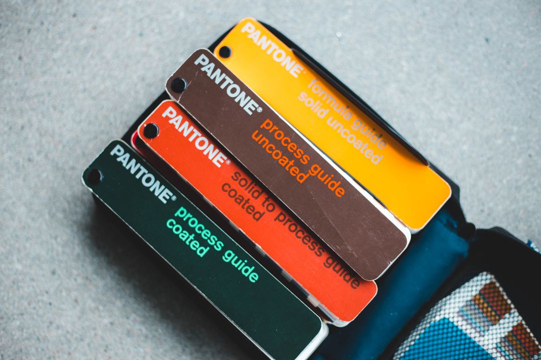
- Honest Advice and Proofing: If a specific colour in your design simply cannot be reproduced in standard CMYK printing, we tell you upfront. We offer clear, practical solutions, such as recommending specialised Pantone spot inks, adjusting background values, or selecting high-vibrancy paper finishes.
- On Brand, On Time Guarantee: We take responsibility for the final result. If your artwork needs fixing, we fix it. You get complete peace of mind that your finished print will look sharp, crisp, and professional.
Seasonal Print That Makes Your Brand Shine
As we navigate the busy year-end marketing season, colour accuracy becomes even more critical. Whether you are producing bespoke holiday greeting cards, seasonal promotional flyers, event banners, or custom calendars, your print represents the quality and professionalism of your business.
Print Lord’s seasonal printing range is designed to help you celebrate every season with confidence. Every seasonal print order includes free file checking and free UK delivery, ensuring that your festive promotions look as brilliant on paper as they did in your imagination.
Whether you are launching a Christmas marketing drive, preparing end-of-year corporate gifts, or updating your retail display materials, do not leave your colour fidelity to an automated guess.
Quick Tips for Better Print Results
If you are currently designing artwork in Canva or another digital tool, keep these practical tips in mind:
- Avoid Extreme Neons: Try to select slightly deeper, richer tones during the design phase rather than ultra-saturated neon shades that only exist in light.
- Watch Your Dark Blues: In CMYK, adding too much magenta to cyan turns blue into purple. Keep your cyan high and magenta low for clean blue tones.
- Include Bleed and Margins: Always extend your background graphics 3mm beyond the edge of the document to avoid unsightly white paper borders when cut.
- Let Print Lord Pre-Flight It: The simplest tip of all is to send your raw file to Print Lord. We catch artwork issues, fix colour shifts, and ensure your final product arrives on brand and on time.
Your Print, Sorted
Great print is not just an expense; it is an asset that builds trust, commands authority, and drives real results for your business. Do not let raw RGB colour conversions dull your impact this season.
Bring your designs to Print Lord. From simple Canva tweaks to complex multi-part commercial print runs, we have over three decades of experience making sure your brand looks exceptional.
Print Lord. At your service. On brand. On time.
Explore our full range of products at printlord.co.uk or check out our Seasonal Printing Options to get your year-end marketing sorted today.