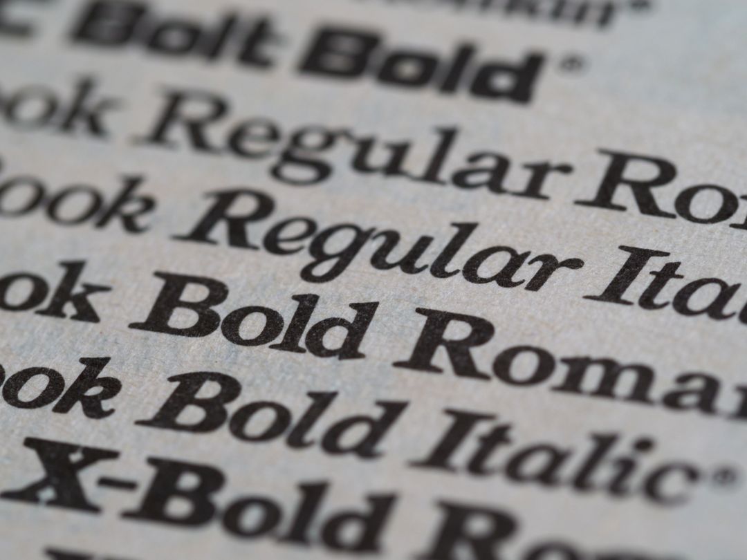
Typography is the silent engine of brand identity. The specific shape, weight, and personality of your letters tell your audience who you are long before they read the headline. In modern graphic design, platforms like Canva have democratised access to thousands of beautiful typefaces. With a single click, business owners can pair sleek sans-serif headings with elegant script subheadings, creating eye-catching posters, flyers, and brochures in minutes.
However, moving a design from a digital screen to a commercial printing press introduces a crucial technical bridge: font licensing and typeface embedding. Many small businesses assume that if a font renders perfectly inside Canva, it will automatically print with identical precision on paper. Unfortunately, when files leave the digital canvas, missing fonts, unintended font substitutions, and licensing glitches can quietly alter your artwork.
At Print Lord, every job is treated as mission critical. Whether you are printing fifty luxury invitations or ten thousand corporate prospectuses, brand consistency is paramount. Understanding how fonts work, how desktop licensing applies to commercial production, and how to properly flatten or outline your text will guarantee your artwork prints exactly as intended.
Understanding the Difference Between Web Display and Commercial Printing
To understand why font errors occur, it helps to explore how digital software handles typography. When you design inside a browser-based application like Canva, the software renders fonts on your screen using web display files or dynamic cloud streaming. The font files reside on secure cloud servers rather than on your computer’s hard drive.
When artwork is exported for commercial printing, the digital printing press needs access to the raw outline vectors and font instruction tables of those exact typefaces. If those instructions are missing or restricted, the press rasterisation engine cannot draw the letters accurately.
When a printing press encounters an unrecognised or unattached font, it defaults to a fallback typeface, often resulting in plain, generic letters like Arial or Courier. Headlines jump out of alignment, line breaks shift across paragraphs, and carefully styled logos suddenly look disjointed. Print Lord steps in before these errors reach the paper, but knowing how to prepare your files avoids unwanted delays in your schedule.
Font Licensing vs Desktop Rights: What You Need to Know
A font is not simply an image; it is a sophisticated piece of software protected by intellectual property laws. When a typographer creates a font, they grant users specific permissions through an End User Licence Agreement (EULA).
Different font licences grant different rights:
- Web and App Licences: Allow fonts to display on websites or within specific application interfaces.
- Desktop Licences: Allow a user to install the font on a local computer to design documents.
- Commercial Print Rights: Permit the embedding of font data inside static documents, such as PDF files destined for commercial press runs.
Canva provides a vast library of free and Pro fonts that are fully licensed for commercial end-product creation within their ecosystem. However, if you upload a proprietary custom brand font into Canva (such as a custom typeface commissioned specifically for your company), you must ensure that your organisation holds the proper desktop and embedding rights for commercial print production.
If a custom font carries restrictive embedding permissions, exporting the artwork into a standard PDF format can strip the typeface data out entirely. This is one of the most common reasons custom corporate branding undergoes unexpected font substitution during pre-press checks.
Font Embedding vs Outlining Text: The Practical Technical Solutions
To ensure your typography arrives at the print workshop intact, there are two primary industry methods for securing typefaces within digital artwork: font embedding and outlining text.
Method 1: Full Font Embedding in PDF Files
Font embedding means taking the font file’s subset vector curves and embedding them directly into the export PDF document. When Print Lord opens your print file, the exact mathematical descriptions of every letter, number, and punctuation mark are contained within the file itself.
When exporting artwork from Canva:
- Always choose PDF Print rather than PDF Standard. PDF Print is specifically built for physical production and includes vector information necessary for commercial press workflows.
- Ensure you select the highest quality output settings.
- If your design uses standard Canva library fonts, PDF Print automatically embeds the required subset vectors into the document.
Method 2: Converting Text to Outlines (Curving Text)
While font embedding works brilliantly for standard document layouts, converting text into vector outlines remains the ultimate safeguard against missing font errors.
Converting text to outlines (sometimes referred to as “curving” or “converting to paths”) transforms your letters from editable text into fixed vector shapes. Once text is converted to outlines, the printing press no longer views the document as containing fonts at all; it sees pure graphic artwork, identical to a vector logo or illustration.
Why convert text to outlines?
- Eliminates font substitution risks entirely: Because the file contains shapes rather than font files, no font substitution can ever occur.
- Bypasses licensing restrictions: Converting text to shapes prevents pre-press rasterisation engines from looking for missing font licences.
- Preserves custom typography: Complex kerning, custom letter spacing, and decorative flourishes remain locked in position down to the fraction of a millimetre.
While Canva handles basic font embedding during PDF Print export, users working with custom brand fonts or complex typographical layouts can flatten or convert text elements to ensure absolute fidelity. If you are ever unsure whether your Canva export has preserved your exact brand fonts, the Print Lord team can inspect your PDF during pre-press checks to confirm all vector paths are secure.
Common Typographical Mistakes in Canva (and How to Avoid Them)
Creating artwork in digital tools is quick and convenient, but a few subtle mistakes can spoil an otherwise brilliant campaign. Here are the top typographical issues observed during commercial prepress:
1. Using Micro-Sized Serif Fonts on Dark Backgrounds
Serif fonts feature delicate strokes at the ends of letters. When tiny serif text is set against a dark background in reverse print (white text on dark ink), liquid ink can bleed slightly into the fine lines, making the text blurry or difficult to read. For small body text, crisp sans-serif typefaces or slightly bolder weights perform significantly better.
2. Over-Tightening Letter Spacing (Kerning)
Adjusting kerning inside design tools can make headlines look dramatic on screen. However, on physical paper, letters that touch or overlap digitally can blend into an unreadable block when printed. Maintain healthy spacing between letters, especially for printed marketing collateral viewed from a distance.
3. Relying on Low-Resolution Text Exports
Exporting your Canva design as a JPG or PNG instead of a PDF converts your razor-sharp vector text into pixels. When scaled up or printed on commercial machinery, pixelated text appears fuzzy around the edges. Always export as PDF Print to keep typography crisp and vector-sharp.
Print Lord Artwork Support: Complete Peace of Mind
At Print Lord, we understand that small business owners and busy marketing managers do not have hours to spend troubleshooting technical pre-press settings. You need your printed collateral to reflect the true quality of your business, delivered on time and without fuss.
Our approach combines modern digital convenience with hands-on print expertise. We do not rely on faceless, automated order portals that print bad files without checking them. Instead, every piece of artwork submitted to Print Lord undergoes careful brand guardianship. If a missing font, restricted licence, or un-embedded typeface threatens the outcome of your project, our inner circle steps in immediately to resolve the issue.
Whether you need a quick Canva rescue mission or expert advice on selecting the ideal paper stock to complement your typography, Print Lord provides the guidance and craftsmanship required to make your brand stand out.
Print Lord. At your service. On brand. On time.